-
Architects: Jost Architects
- Area: 238 m²
-
Photographs:Andrew Wuttke & Project Client

Text description provided by the architects. The project was the complete revival of small home on death’s door. Other than applying the standard functional and aesthetic requirements of a small family within their financial considerations, urgent architectural CPR was required. Despite the misgivings of others, the clients’ and project team recognised an opportunity to create a unique home, embracing the history of the building and meeting the obvious challenges with excitement.

The council Heritage Overlay meant that the original, severely dilapidated Singapore Cottage prefab, built in the 1850s could not be “bowled over” (the first thought of every person who ventured into the house); instead it was lovingly retained. Part of the enjoyment of the process for everyone involved was learning about its past life, something which I often ignored, not intentionally, by concentrating on the “new part” of a project where an old building is refurbished and extended. The framing was marked with Roman Numerals to enable it be put together after it being shipped and delivered on site and to be taken down and relocated if required. There were layers of building linings both inside and out such as wallpaper from the 1870s and roof shingles under the corrugated iron sheeting as they were peeled away There were many theories on what the building was actually used as many years ago, a general store, a halfway house for farmers and travellers or potentially a brothel due to this profession’s history in the suburb its located in.

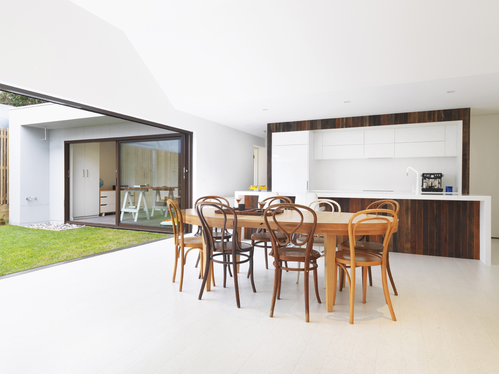
The first challenge was to overcome the limited site size - 238m2 - in order to fit the brief, which called for an open plan living, dining, kitchen, rumpus room, bathroom, walk in pantry, walk in laundry, master bedroom, ensuite, walk in robe, 2nd and 3rd bedrooms and an outdoor area. This was accomplished by building around “the back yard” in a “U” shape facing north. Materials and finishes were selected to be hard-wearing and maintenance-free, to endure the enthusiastic creativity of young children, while remaining sympathetic to adult sensibilities. The group objective was to create a highly contemporary space with enduring and classic features.

A neglected and universally overlooked property has been transformed into a clever, modern home. The spaces combine both classic and modern materials and finishes - such as clean white cork flooring, white acrylic bench tops and white fittings - with less ubiquitous, yet equally appealing ones, like the striking orange, studded rubber flooring, original 1870s layered wallpaper , and rustic recycled messmate timber boards. Rather than create dissonance, the contrasts work extremely well together, forming a minimalistic and simple aesthetic with a controlled contrast of colour and texture.

The process delivered an outcome that, after comparing the original decaying building with the completed project, is both impressive and surprising; It is clean yet interesting, preserves its colourful antiquity whilst being progressive, and functions incredibly well, considering the site’s spatial constraints. The home pushes boundaries with purpose; it is a unique home yet is very easy to embrace and is in no danger of dating.

The considerable discussions during the design and documentation process, which included the implementation of specific sustainable choices, ultimately came down to prioritising items based on cost and value for money, as is very often the case with smaller projects.

Considerations included long-lasting and durable sustainable materials. Such as cork and rubber flooring and recycled timber cladding, the use of hydronic heating and the omission of air conditioning. The planning and structural co-ordination endeavoured to minimise the use of steel, favouring timber framing through sensible spans and cantilevers. But ultimately what stood out in terms of sustainability, was the common sense application of standard, good thermally passive design techniques.

The project replaces a sad, disintegrating building with a house that the clients love coming home to. The simple aesthetic of the façade concealing something exciting behind, generates a curiosity in passers-by, who are often found marvelling at its blend of history and restoration with interest. It has given another 100+ years to a house that has already done 165.


.jpg?1427769308)


